
Credit: http://youtube.com
Hey everyone! Today I'm going to be talking about YouTube's new channel Layout: Youtube One. To be honest, I hate it. My review will mainly be from a creator's point of view (because if you didn't know, I have a channel), rather than someone who just watches YouTube, because from the outside, it looks great! The reason I dislike it is because of how difficult it is to make it look good, seriously.
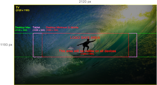
This, is basically the layout you have to create. The easiest thing they could have done with the layout would be to upload a different banner for every device, or just resize the picture for the different devices, but instead, they decided to make the template like this.
 As you can see, this obviously would not work with the new One design. This is because on the logo safe area, you would only see a really small, zoomed in version of the controller, and would only see the full banner on the TV format, which is where I get my least traffic. This really means that you have to have a lot of blank space (as shown in the template). So for me, the new layout just takes the creative aspect away from channels, which I always enjoyed. Because if you do something creative in the safe area, it will just end up looking weird on other formats because of all the extra space, and if you do something creative on the TV area, no one will see it except TV audiences. I feel like this whole new layout is Google's attempt to fix something that was never broken. I imagine soon YouTube will be pushing everyone to this new format. As for me, I'll hold out on the old design for as long as I can.
-Colby
So this is how I wanted to make my banner (Below)
-Colby
No comments:
Post a Comment