Sunday, August 11, 2013

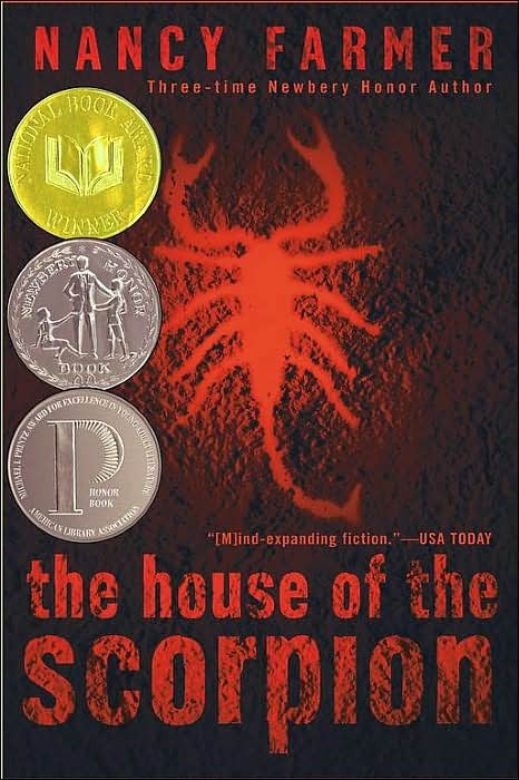
The House of the Scorpion- Nancy Farmer Book Review

Yeah, I know the last miscellaneous review was 4 months ago, stop judging me.
----------------------------------------------


Hey everyone, today I'm reviewing the acclaimed Nancy Farmer book The House of the Scorpion. The format of today's review is going to be a little different, with me going over the pros and cons of the book, and then giving a breif description of my reasoning, as I feel this is the best format for a book review. Anyways let's jump right in.

SUMMARY: The House of the Scorpion by Nancy Farmer is an intriguing story about a young man who discovers he is a clone and must struggle to learn what this means. Matteo Alacran, a clone harvested from the DNA of El Patron, the Master of Opium, is treated poorly by the Alacran family and servants, despite his superior education and his attempts to fit in. After escaping death by fleeing to the neighboring nation of Atzlan, Matt faces isolation for reasons he never imagined. Source: http://www.bookrags.com

Pros: Unique setting, thought provoking topic, always has intense feeling, making me wonder what's going to happen next, great character development

Cons: multiple unnecessary plot points, after climax book falls flat

The House of the Scorpion is a great book, and Nancy Farmer definitely paints a picture, allowing me to envision every location in this alternate future perfectly. In fact, that's one of the many strong points of this novel, the settings. Each individual location is incredibly unique, (allowing for much more unique/dynamic plot points to develop) with Farmer describing every nook and cranny of the setting, allowing me to explore it, and make me feel like I'm really there.

Another great feature to this book is that there's always a wave of intensity over this book, making me eager to flip to the next page, to see what happens. There's always something brewing beneath the surface, and you have to key into every detail, or you might miss something.

However, this brings me to one of my (very few) gripes, unnecessary plot points. This book strives on details, sometimes going through 4 or 5 pages going through 5 seconds of a character's thought process. However, a large portion of the book is dedicated to side stories about the main character Matt, and while they are interesting and add to a sense of adventure present in the book, they deviate from greatly and in no way advance the main plotline, thus lengthening this already long novel about 100 extra pages.

So while these side quests do add another level to the adventurous feel found in this book, they greatly stall the main plotline, making for an overly long story.

Overall The House of the Scorpions is a great story, packing adventure, fear, dread, romance, and tearjerking moments all in to one incredible novel. While the story does fall flat after the climax (which occurs around the 200-250 page mark) Farmer more than makes up for it in her wonderfully detailed writing style, and her intricate character development, in which she captures each character's individual quirks every time they're present. So overall, if you haven't yet I'd definitely suggest you pick it up now! Before its sequel hits the shelves in September.
Wednesday, April 3, 2013

Youtube One! New Youtube channel Layout Review!


Credit: http://youtube.com

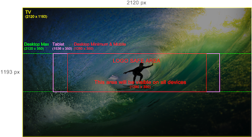
Hey everyone! Today I'm going to be talking about YouTube's new channel Layout: Youtube One. To be honest, I hate it. My review will mainly be from a creator's point of view (because if you didn't know, I have a channel), rather than someone who just watches YouTube, because from the outside, it looks great! The reason I dislike it is because of how difficult it is to make it look good, seriously.
                                            Credit: http://youtube.com

This, is basically the layout you have to create. The easiest thing they could have done with the layout would be to upload a different banner for every device, or just resize the picture for the different devices, but instead, they decided to make the template like this.

So this is how I wanted to make my banner (Below)

As you can see, this obviously would not work with the new One design. This is because on the logo safe area, you would only see a really small, zoomed in version of the controller, and would only see the full banner on the TV format, which is where I get my least traffic. This really means that you have to have a lot of blank space (as shown in the template). So for me, the new layout just takes the creative aspect away from channels, which I always enjoyed. Because if you do something creative in the safe area, it will just end up looking weird on other formats because of all the extra space, and if you do something creative on the TV area, no one will see it except TV audiences. I feel like this whole new layout is Google's attempt to fix something that was never broken. I imagine soon YouTube will be pushing everyone to this new format. As for me, I'll hold out on the old design for as long as I can.
                                                                                                                -Colby

Sunday, March 24, 2013

Adblock: The best and worst browser extension

Image Credit: http://adblockplus.org/

*QUICK REVIEW* Adblock, is a very interesting extension. It works extremely well, and I can't think of anytime I'd ever had a problem with it. I used to really enjoy Adblock, until I found out exactly what it did. When you use Adblock on your favorite websites for a better browsing experience, you're taking revenue away from them. You're taking away the revenue they use to keep their site running. It may not seem like much if only one person is using it, but millions of people are using it. This could end up damaging some websites to the point where they have to shut down. I have stopped using Adblock after realizing this, and maybe now you will too.

                                                                                                                      -Colby

Saturday, March 2, 2013

The top four browsers, which is right for you?


credit for picture: blog.mfisch.com

Hey guys! Today I'm going to go over the major 4 browsers, Chrome, Safari, Firefox, and IE. We'll figure out which is for you, based off what you need. Let's start with chrome.

Chrome

The Good: At least with my connection. Chrome is always the quickest out of the 4, easy to pick up quickly, everything is right there/easy access to everything, has TON of extensions to make Chrome even better!

The Bad: UI (User Interface/Design) gets boring really quickly [even with the ability to have customized themes], and this may just be me but getting to my bookmarks is always a hassle.

Internet Explorer

The Good: Hahahahahahahahahaha! Oh... you're serious? Something good.... uhhh..... its the most laughable browser... so it's the funniest browser! There!

The Bad: The slowest of the four (and slower than many other more minor browsers), little support for extensions, definitely the worst UI, most prone to viruses, no automatic flash updates, of the few extensions it has, many are very buggy, no portable version, no syncing with other computers you have that use IE. The list goes on, but if you're not already convinced not to use IE, then... I don't know.

Safari

The Good: Beautiful UI (Best of the 4), easy access to everything like Chrome (but also easy access to bookmarks), fairly speedy, easy access to any blog's (even ours!) RSS feed, top sites let you see what sites you visit regularly, large library of extensions.

The Bad: There really isn't many bad things about Safari, so it won't be in a list form.  Basically my problems with Safari is that it could definitely be faster, I'm not saying it's slow, but it could be much faster.  Also, I said that there was easy access to everything, but sometimes it actually feels like Safari is just cluttered, and has some unnecessary features. 

Firefox

The Good: Fast, large extensions library, this doesn't look like much, but there just isn't a big description for either of those 2 things.

The Bad: Childish, boring UI, very cluttered, hardest to understand.


Final Thoughts

So, overall here's what I think.  Never use IE.  Chrome or Safari are definitely the best in my opinion.  Firefox is good, but it's just not the best, but it has potential and still has room to grow.  So my main one I use is Chrome, but sometimes I switch over to Safari.  Tell me what browser you guys use in the comments.  See you next time!
                                                                                                                            -Colby